Skip Intro, from a hunch to 136 million taps a day
A button for members who were already skipping the opening credits, now pressed about 136 million times a day.
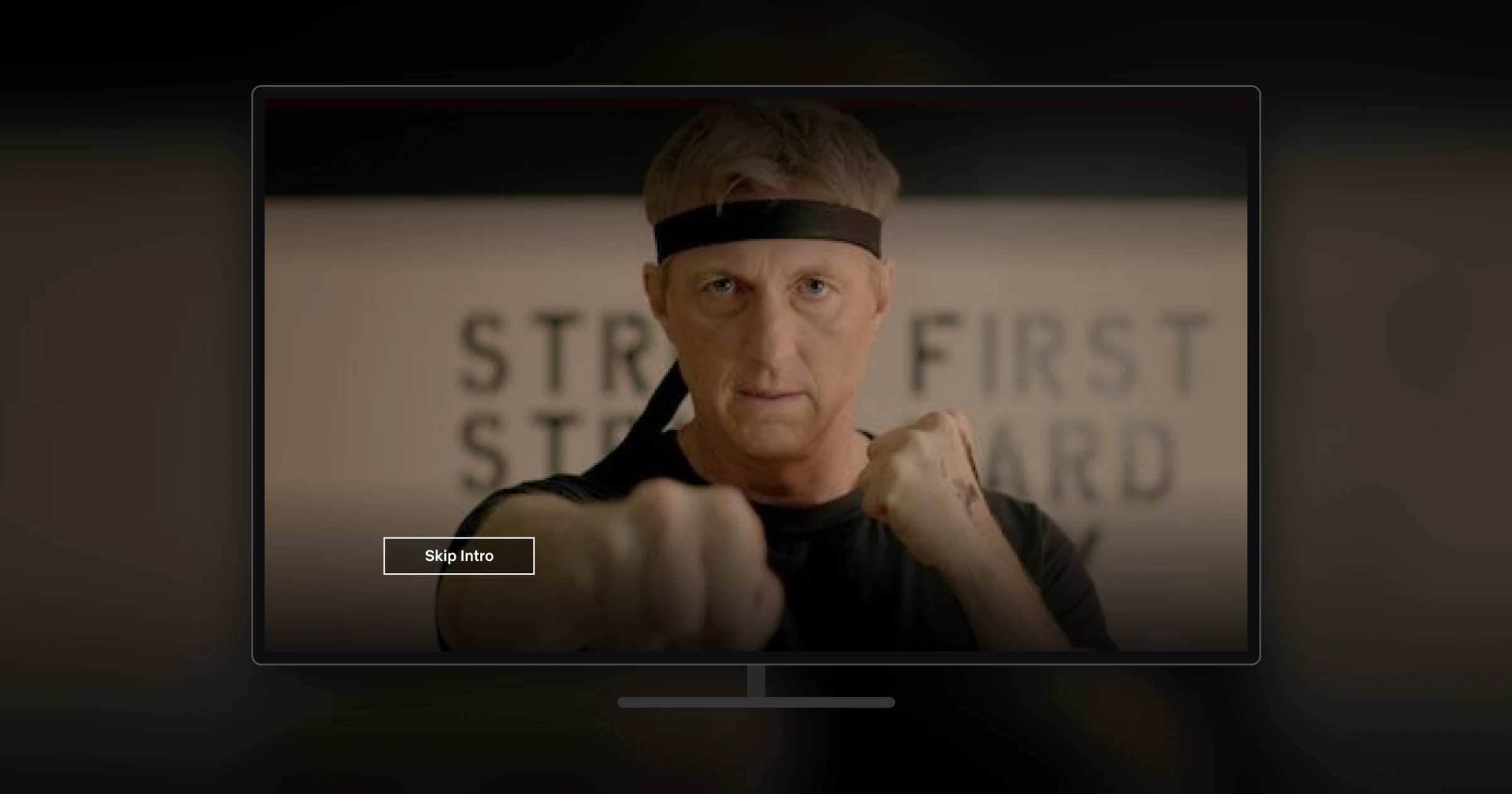
In brief
- The problem
- About 15% of the time, members were manually skipping forward in the first five minutes of an episode, mostly to get past the opening credits and recaps.
- What changed
- Members press it about 136 million times a day, and tests on TV and mobile found gains in both streaming and retention.
- My part
- I led design. I built the prototype and ran the first research with our researcher, designed the button for the first A/B test on the website, then designed it for TV, and for iOS and Android with our motion designer. I designed the casting experience on my own.
Keep reading for the full story, or skip to the next case study, A home page for Japan that raised sign-ups everywhere →
The full story
Members were already skipping the credits by hand
In the spring of 2016, our product manager, Cameron Johnson, came to me with a hunch. A lot of members were scrubbing forward in the first few minutes of an episode, and he thought they were trying to get past the opening credits. We pulled the data, and about 15% of the time, members were manually skipping forward in the first five minutes. Some shows also open with a recap of the last episode, which feels pointless when you’re watching several in a row.
The idea was simple: give people a button that skips the credits or the recap. To learn quickly, we kept the first test small. It ran only on the website, only in the U.S., UK, and Canada, and only on about 250 of the most-watched titles, few enough that we could check every intro’s start and end time by hand.
A button this small still raised big questions. How will people know what it does? Will they trust that it took them to the right place? How should it appear and disappear? And how long should it stay on screen? The research and the tests that followed were how we answered them.
Research added “Skip Intro” to the test
Before the A/B test, we ran a round of quick interviews: six members, 15 minutes each. I built an interactive prototype, and our motion designer made two videos, so we could compare three ways of moving people past the credits:
- Simple fade: the video fades out, the scrubber moves forward, and the video fades back in after the credits
- Fast forward: the video visibly speeds through the credits
- Thumbnail frames: the scrubber moves forward while showing a few frames from the skipped section
Almost everyone noticed the button and pressed it without being asked. The simple fade was enough for everyone. Fast forward helped a little with knowing where you’d landed, but not enough to justify building it. Most people missed the thumbnail frames, and the ones who noticed them were confused; one asked whether they could tap the images. I recommended the simple fade, which was clean and told people enough about where they’d landed, and that’s what shipped. The landing point mattered as much as the transition, because if the button dropped people in the wrong place, they would stop trusting it.
That first concept explored how the action might animate onto the screen. In later versions, I turned it into a button that reused the player’s existing button styles, so it looked like part of the player, and worked with our motion designer to tune how it animated on and off the screen.
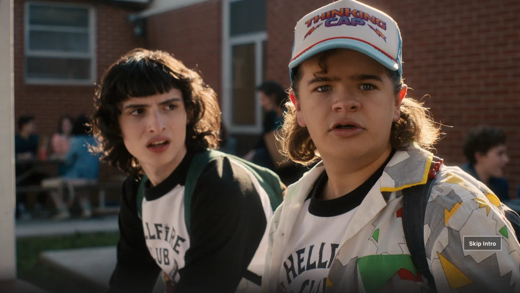
We ended each interview with a naming exercise, comparing labels side by side: Skip Credits, Skip Intro, Skip Titles, Skip Recap, Skip, Skip Ahead, Jump Ahead, and Jump Past Credits. Anything vague got the same question every time: skip where, and how far? “Skip Titles” confused people. “Skip Credits” and “Skip Intro” clearly stood out. Several participants had already described the feature as skipping the intro without being prompted, so we added “Skip Intro” to the A/B test.
Skip Intro and Skip Credits tied, and the credits decided it
The website test had seven cells. They compared labels, and whether the button should appear on TV credits, recaps, movies, or only when the player controls were showing. “Skip Credits” and “Skip Intro” performed almost identically, and both did much better than “Skip” or “Jump Ahead.”
Our content team was worried that “Skip Credits” would read to filmmakers and crews as saying the recognition in the credits didn’t matter. Since “Skip Intro” performed just as well, we chose the softer label.
Members kept using it, so we launched it
Streaming and retention didn’t move, and those were the main arguments against launching. But engagement was unusually high. Most members who saw the button used it, and they kept using it, episode after episode. In the web player, it became the most-used button after full screen. Members also posted about it on social media far more than we expected. “I love and die for the skip intro button on Netflix,” one wrote. Another: “netflix now has an option to Skip Intro. i really really love life.”
We decided to launch it on the website and roll it out to other platforms with holdback tests, so we could keep measuring. Along the way, we made two changes in response to concerns from the creative community: we removed the button from movies, and we stopped showing it on the first episode of a Netflix original series, so new viewers would see the intro at least once.
I designed the TV version too. On most platforms, the button sat on the right edge of the screen, to suggest moving forward. On TV, I put it in the lower left, because of how people move with a remote. The button took focus when it appeared, so pressing OK skipped the intro. Any other button brought up the player controls, so Skip Intro had to sit in line with them: just above play/pause, one press away in either direction. Apple TV was the exception. At the time, we couldn’t change its player controls, so we added an invisible layer on top of them to hold the button. There it stood on its own, so it went back on the right.
Rolling it out also meant knowing where the intro starts and ends in every episode, for the whole catalog and every new title. Checking 250 titles by hand worked for a test but couldn’t scale. We showed engineering that an intro doesn’t always come first: shows like House of Cards open with a scene before the credits, so every title needed both a start and an end time. From there, our engineering team used the machine learning and image recognition tools they were building to detect intros automatically, so the button could reach the full catalog.
On phones, the button had to work with the player controls
With our motion designer, I designed Skip Intro for iOS and Android. The hard part was how the button should behave alongside the player controls, which come and go as you tap the screen. I wrote the behavior out step by step in the design spec:
- When the intro starts, the button appears on its own, even if the controls are hidden. It sits where it won’t collide with the controls if they appear.
- If you don’t press it, it stays for six seconds and then fades out.
- After that, it’s tied to the controls. Tap to show the controls and the button comes back, as long as the intro is still playing.
- Press it and the video jumps to the end of the intro, and the button animates away.
- When the intro ends, the button is gone either way.
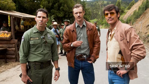
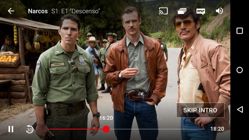
On its own when the intro starts (left), and with the player controls (right).
When the mobile player redesign shipped, I updated the button to match: it moved up with the controls when they appeared, instead of sitting in a fixed spot.

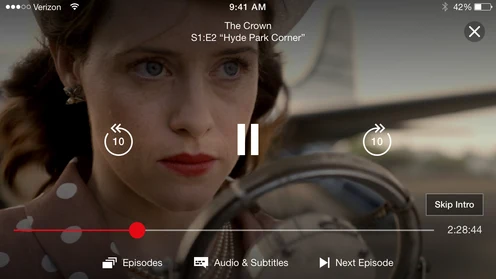
With the redesigned player, the label changed to sentence case, and the button moves up to make room for the controls (right).
The 2017 holdback tests on Android, TV, and iOS found what the first test hadn’t. Retention went up for members new to the device on TV, and streaming went up across several of the tests. That was a surprise, since skipping the intro makes every episode shorter. The only explanation is that members watched more episodes per session, and the data on episodes watched backed that up. Phones had the highest usage of any platform.
When casting, the TV shows the button and the phone presses it
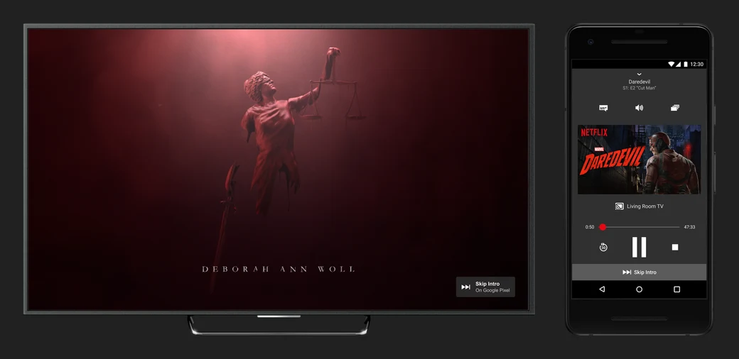
In 2018, I designed Skip Intro for casting from a phone to a Chromecast. When you cast, the TV plays the video, but your phone is the remote, so the button had to be split across two screens. When the intro starts, a small badge appears on the TV. It includes the same icon as the button on your phone, so you know what to look for. On the phone, the button appears in the mini player and the full player card, and on Android it also appears on the lock screen and in a notification. The team agreed early that the icon alone wasn’t clear enough on the phone, so the button there always includes the “Skip Intro” label.

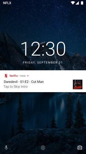
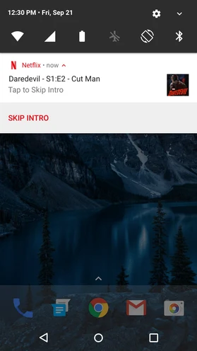
On Android, you can skip the intro from the lock screen or a notification without opening the app.
How I built the prototype
I built the research prototype in plain HTML, CSS, and JavaScript, with a custom video player. It had settings for when the button appeared, how long it stayed on screen, when it went away, and where in the video it jumped to. Because the intro’s start and end were settings too, I could load any video we had access to, including shows with a cold open before the credits. That let us change the timing between interviews without rebuilding anything, and play the three transitions on the same episode so people could compare them directly.
The outcome
In a later retrospective, Cameron noted that on a typical day, members press Skip Intro about 136 million times, saving a combined 195 years. Other streaming services, including Amazon Prime Video, Hulu, and Disney+, have since added their own versions.
Skip Intro taught me that a feature that looks simple can get complex quickly. Beyond the button itself, we had to think about the filmmakers and crews who make those intros and credits, and how they would feel about a button that skips past them. Research proved its value again, even at the scale of six short interviews. It confirmed our hunches and helped us get the label and the transition right from the start, instead of relying only on A/B tests.
It also taught me not to scale too soon. If we had built the tools to find every intro’s start and end before the A/B test, and the test had come back negative, we would have wasted a lot of time, effort, and money. Limiting the first test to 250 titles we could check by hand got us the read we needed with far less work.
Press
- Netflix is testing a button for skipping the opening credits — The Verge
- Netflix’s ‘Skip Intro’ Button Makes TV Ever More Like an App — The Atlantic
- Surprise! Netflix Just Rolled Out Another New Feature — Refinery29
- Netflix now lets you skip show intros while streaming via Chromecast — 9to5Google
- Looking Back on the Origin of Skip Intro Five Years Later — Netflix