Putting downloads in plain sight
Designing offline viewing for mobile, where research showed visible download buttons beat a tidier hidden design.
In brief
- The problem
- After Netflix launched globally in 2016, many members lived where internet was unreliable or data was expensive, and they needed a way to watch without a connection.
- What changed
- Engagement was strong. It was highest where connections were poorest, and higher than we expected everywhere else.
- My part
- I was one of several designers on the project from the beginning. I proposed, owned, and defended some of my own concepts, but my main role was prototyping, and the final design was a team effort. I built a simulated download into the prototype so research participants reacted to the design, not to how fast a download finished.
Keep reading for the full story, or go back to all the work →
The full story
For years, Netflix’s official position on offline viewing was that it was never going to happen.1 As late as 2015, Netflix’s chief product officer, Neil Hunt, said he wasn’t sure people wanted to bother.2 That changed in 2016.
In early 2016, Netflix launched globally and started serving members in countries where internet connections were unreliable and data was expensive. For many of them, watching without a connection was a basic need. As it became clear how much offline viewing mattered in some of those markets, leadership changed its position. By April, CEO Reed Hastings was saying the company should “keep an open mind,”3 and in late 2016 we shipped Netflix Downloads, which let members save shows and movies to their phones and watch them without a connection.
I was one of several designers on the project from the beginning. I proposed and defended some of my own concepts, but my main role was prototyping, and the final design was a team effort.
Other apps showed the tradeoff we’d face
Before we designed anything, I went through how other apps handled downloads: Amazon Video, YouTube Red, and Vimeo, plus music apps like Spotify and Apple Music. I broke the experience into its parts: the download button on a show’s page, downloading from browse, showing progress, a place to manage downloads, what happens when you lose your connection, empty screens, and settings.
The apps showed the same tradeoff we’d face. Amazon’s download buttons were cluttered, but you could always see what to do and where. YouTube and Vimeo were cleaner, but they tucked downloading into menus that were easy to miss. Almost none of them handled being offline well; YouTube was the only one that sent you straight to your downloads when you lost your connection. Settings were vague, too. Amazon offered “Good,” “Better,” and “Best” download quality, which told people nothing about how much space a download would take.
Downloads had to be easy to find without cluttering the app
Downloads was going to be heavily used in some markets and barely touched in others. We had to make it easy to find for the people who needed it without adding clutter for everyone else.
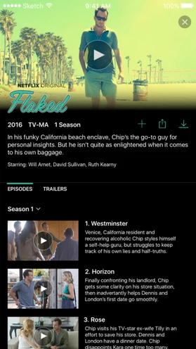
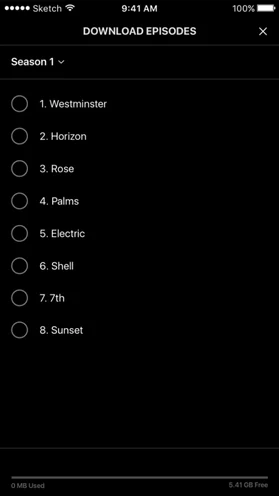
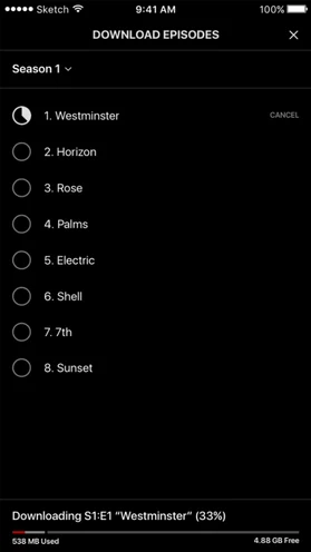
Our early explorations leaned toward minimizing the feature’s footprint. One concept put everything behind a single download icon per series. Tapping it revealed a compact episode list where you could queue individual episodes, along with a storage indicator showing how much space your device had left. The idea was to surface the feature without scattering download icons across every episode row. Research showed this was the wrong approach.
Research favored a download button on every episode
One part of our research took me to China. I spent time there testing our prototypes with people and studying the streaming apps they used, which had supported downloads for a while. Those apps weren’t really competitors, since Netflix isn’t available in China, but seeing how they handled downloads was really informative.
A researcher on our consumer insights team had also reviewed the major Chinese apps. People there watched offline as a routine: on commutes, underground where there was no signal, and while waiting, partly because mobile data was expensive. The apps let you pick several episodes and a video quality at once, showed a download queue, and clearly marked titles you couldn’t download. One of them already offered a “smart download” that suggested videos to save whenever you were on Wi-Fi.
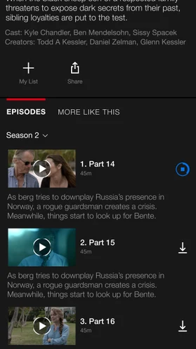
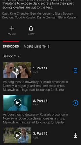
Testing showed that members responded best to download icons placed directly and obviously next to each piece of content. Our worry about clutter didn’t hold up. People didn’t find the icons distracting, and hiding the feature behind an extra tap made it harder to find.
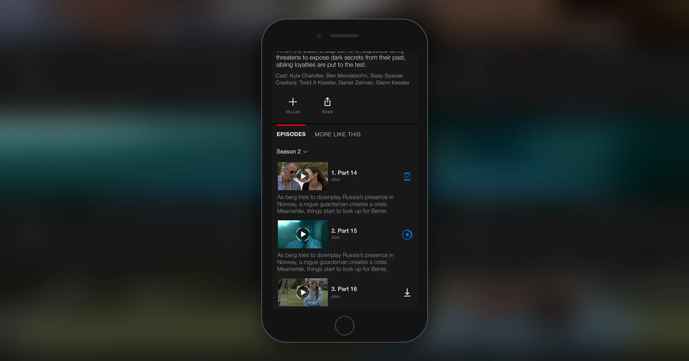
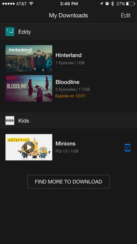
The final design put the download buttons in plain view: next to each episode on the show detail page, with clear in-progress and completed states, and a dedicated Downloads tab to manage everything saved to the device.
Simulating downloads in the prototype
I built several prototypes across this project, with the final versions in HTML, CSS, and JavaScript running inside of a native Swift wrapper to approximate an iOS app. Downloads added a problem of its own: the prototype had to show downloads in progress without downloading anything.
Early on, we learned that perceived speed could skew feedback. If a simulated download finished instantly, people reacted to the speed instead of the design, so the prototype needed to behave like a download on a typical connection.
I wrote a function that advanced a progress bar at a randomized rate, mimicking the variable speed of an actual download. The interval and increment values could be tuned to simulate faster or slower connections depending on what we were trying to test.
// Initial progress is 0
let progress = 0;
// Generate a random integer
const getRandomInt = (min, max) => Math.random() * (max - min) + min;
// Start a new interval timer
const downloadTimer = window.setInterval( () => {
    // Update the progress every 2 seconds
    updateDownloadProgress();
}, 2000);

// Method to update progress
const updateDownloadProgress = () => {
    const newProgress = progress + getRandomInt(0, 0.06);

    if(newProgress < 1) {
        // Our download is still in progress...
        // Update the progress
        progress = newProgress;
    } else {
        // Set progress to 1
        progress = 1;

        // Download complete, stop the interval timer
        window.clearInterval(downloadTimer);
    }

    // Log the progress for testing purposes
    console.log(newProgress);
}
To simulate a slower connection, reduce the max value in getRandomInt() or increase the interval. This kept participants reacting to the design, not to how fast the download went.
The outcome
Because Downloads was a new feature with no prior experience to test against, we couldn’t run a traditional A/B test. Instead, we watched engagement across markets. It was strong, and highest where poor connections made offline viewing most necessary.
We didn’t expect the engagement we saw in markets where we’d predicted little interest. Downloading appealed to members well beyond places with poor internet.
Some ideas for what came next were already in my notes from the start of the project. At the end of my review of other apps, I listed questions for the team: Could downloads manage themselves? Could the app download the next episode automatically, or remove the ones you’d finished? Could it schedule downloads overnight in India, where data was cheaper at night? Later, some of that became Smart Downloads.
Footnotes
-
Netflix shuts the door on offline playback: ‘It’s never going to happen’ — The Verge, 2014 ↩
-
Why Netflix won’t offer offline viewing — WTVR, September 2015 ↩
-
Netflix to keep an open mind about offline viewing — Six Colors, April 2016, citing MarketWatch ↩