Live events in the Netflix row
A two-tile design that became the template for promoting Netflix's biggest live events on TV homescreens.
In brief
- The problem
- Netflix started streaming fights, festivals, and sports live, but the first place many people meet Netflix is a row on their TV's homescreen, built by the TV maker. People who saw a Netflix boxing match there assumed it was pay-per-view.
- What changed
- The two-tile design produced a significant sign-up lift during the event window and became the default for the big live events that followed. The live date-and-time badge I designed went from hand-made artwork to one the image service adds automatically to every live title in the row.
- My part
- I created the two-tile design and owned the visual design of live promotion in the Netflix row on partner devices across more than ten events, from early tile badging through the final template. I made the tiles by adapting existing title artwork. Content designers wrote the copy variants we took to research and A/B tests; PM, engineering, and data science ran the experiments with me.
Keep reading for the full story, or skip to the next case study, Kestrel Gives: rebuilding a charity auction with AI →
The full story
Netflix’s biggest live events had to sell themselves on a screen Netflix doesn’t own
When you turn on most smart TVs and streaming devices, you land on the device maker’s homescreen, not on Netflix. Netflix gets one row there, the Netflix row, filled with titles chosen for you. If you’re not a member, the titles are chosen to make you want to become one. My team, Partner UI, designed everything Netflix shows in those spaces.
The row reaches people before they’ve decided what to watch, and it reaches people who don’t have Netflix at all. When Netflix started streaming live events, the row became the obvious place to promote them: a tennis match, a comedy festival, then boxing, the NFL, and the World Baseball Classic.
I designed the live promotion in the Netflix row for all of them, starting with The Netflix Slam in March 2024. I built each tile from existing artwork for the event, cropping and modifying it to fit the tile and adding the badge and copy.
The tile was my only canvas, and I couldn’t change its shape
Promoting something in a UI you don’t own means designing inside rules you can’t change:
- The partner owns the row. They decide how many tiles it has, their size and aspect ratio, how rounded the corners are, and what focus looks like. Every tile in the row has to match, so a single wide “event” tile was never an option.
- Our artwork is baked into a static image. We couldn’t show a true “Live now” state, because partners cache images on their own schedule. The badge had to make sense whenever it was seen.
- Every string had to fit in every language, at a size readable from across a room.
- Each A/B test only had room for two or three cells, control included. We couldn’t test many variants at once, so each event answered one or two questions and the next event built on it.
That last constraint shaped the whole project. Instead of one big launch, the design came out of a run of events, each one changing the tile.
Each event taught the tile something new
For The Netflix Slam, the localized date and time strings didn’t fit next to the call to action. I shortened them, switched from all caps to sentence case, and asked whether the tile needed the time at all, since people could see it after they clicked. The tile shipped with only the date before the event.
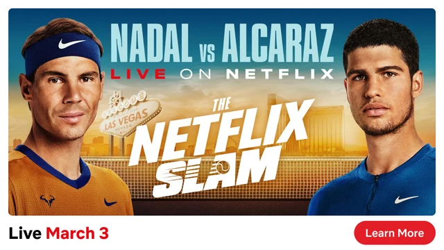
I was wrong about the time. For Netflix is a Joke, we put it back, so that someone who never clicked would still know when to tune in.
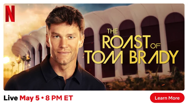
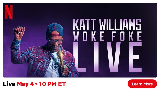
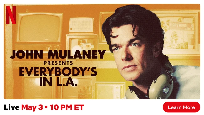
Netflix is a Joke, still in the inherited design, with the time back on every tile.
Then the Joe Rogan test settled it. Brand had a new standard live tile that showed the date but not the time. In that cell, engagement dropped among members who weren’t the target audience for the show. The same standard design with the time added did not cause that drop. From then on, “Live | Date • Time” was the rule.
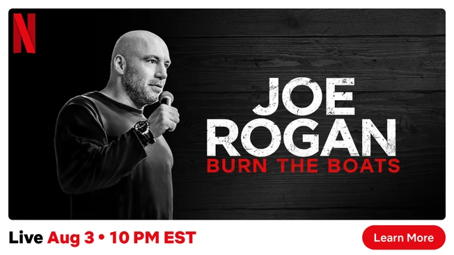
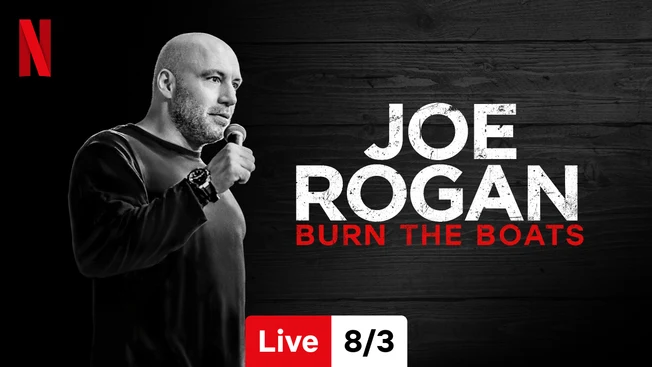
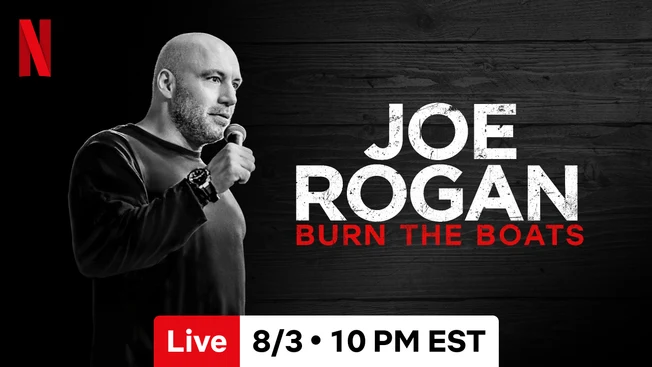
The Joe Rogan test: the inherited design (left), the new standard with the date only (middle), and the new standard with the time added (right). The new design carried through to every event after.
Research showed people thought the fight would cost extra
Jake Paul vs. Mike Tyson was Netflix’s first big boxing event, in a sport where big fights are sold as pay-per-view. Our hypothesis was that the price of a Netflix plan, which included the fight, could be the reason non-members signed up. But a single tile couldn’t hold the event, the date and time, and a price.
So I designed two tiles that read as one promotion, combining the event with the price. The first tile carries the event and its live badge. The second carries the price and what’s included. They share one image across the pair, and both lead to the same sign-up page. For non-members, the pair took the place of the “leading with price” tile that normally sits in the Netflix row.
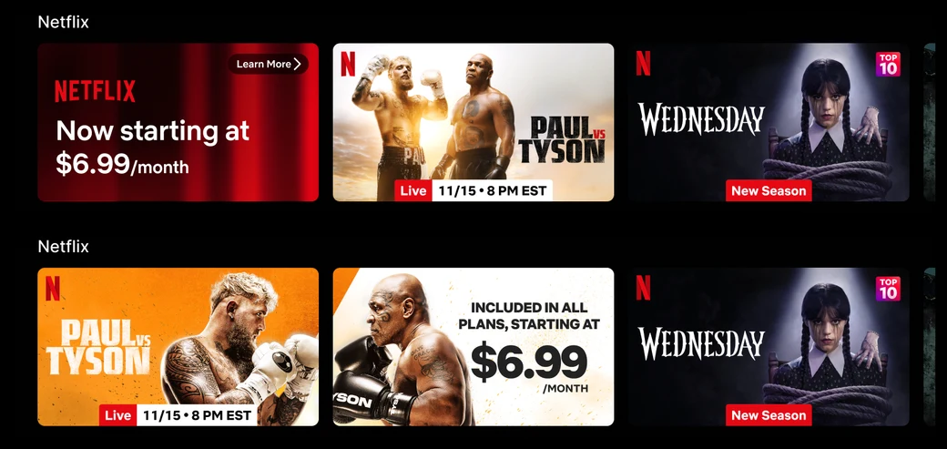
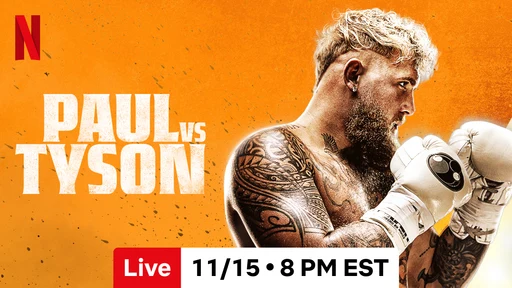
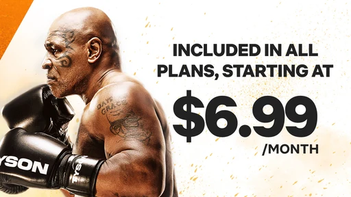
The two-tile design for Paul vs. Tyson: the event and its live badge, then what's included and the price.
Before the A/B test, we ran one-on-one interviews with non-members and former members to check whether people would read the pair as one idea. Most did. The interviews also turned up something we hadn’t expected: the price was so low it made people suspicious. One participant said she was used to paying $80 or more for a fight. Another worried about a bait and switch.
The copy had two jobs: make it clear the fight wasn’t an extra charge, and give people a reason to look. Two lines did it best. “Included in all plans” took care of the pay-per-view worry, and “Only on Netflix” drew people in. We took both into the A/B test.
The decision: two tiles, two days
The two-tile cells produced a significant lift in signups during the event window. Two days of pre-promotion matched seven days for viewing the fight, without the harm to everyday engagement that seven days caused. We turned that combination into the template for future boxing events: two tiles for non-members, one tile for members, two days of pre-promotion.
The copy took one more round. “Only on Netflix” had tested slightly ahead, but for Taylor vs. Serrano we chose “Included in all plans,” because clarity about price was the point. When we tested the copy again for Canelo vs. Crawford, “Only on Netflix” came out ahead again, and it became the standard.
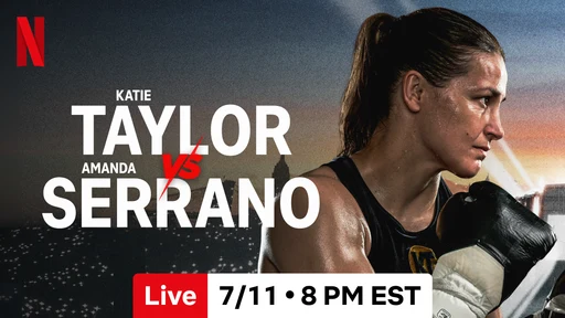
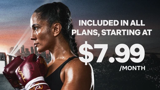
Taylor vs. Serrano led with "Included in all plans."
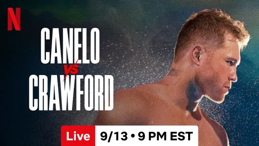
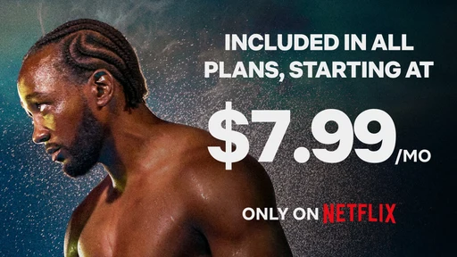
Canelo vs. Crawford added "Only on Netflix," which became the standard.
The outcome
- The pattern became the template. The two-tile design was used for the big live events after Paul vs. Tyson, and we took it beyond boxing. The World Baseball Classic in Japan paired it with a discounted first month and produced significant lift across the whole signup funnel. Star Search showed where it stops working: viewing went up, but signups didn’t move, which told us the pattern depends on the event.
- The badge became infrastructure. I first made the live date-and-time badge by hand for each event. We then worked with the image service to apply it automatically to every live title in the row, so it changes from “Live | Date • Time” to “Live | Today • Time” on its own.
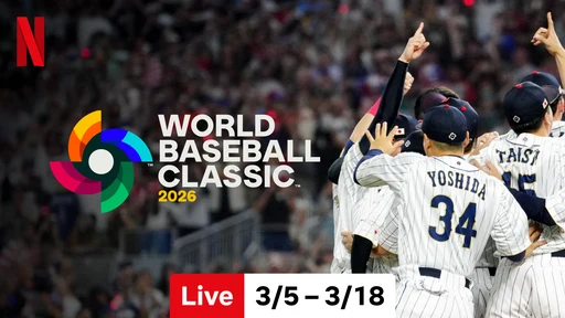
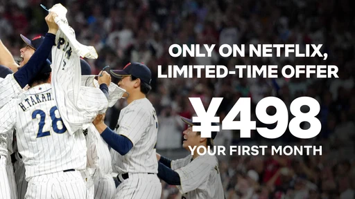
The World Baseball Classic in Japan, paired with a discounted first month.
Looking back, I wouldn’t change the approach. I would have liked more room to test: with only two or three cells per experiment, questions that one large test could have settled took a year of events.