Tile artwork for rows we don't control
A new tile artwork system that holds up in any partner's row, shipped with no harm to signups or engagement.
In brief
- The problem
- Netflix's tiles on TV homescreens used artwork made for Netflix's own app. In partners' rows, rounded corners cut off our logo and badges, and every tile placed its title somewhere different, so the row was hard to scan and had no room for new kinds of content.
- What changed
- The new artwork shipped across the Netflix row in 2026 after testing flat against the old artwork, which was the goal. It's now the foundation for badging new kinds of content, like games and live events.
- My part
- I proposed and designed the new composed tile artwork, and adapted and tested the member team's new badge system for our canvas. When it didn't fit, we kept our red badges and I extended them for new content types and live events.
Keep reading for the full story, or skip to the next case study, Live events in the Netflix row →
The full story
Our tiles were designed for an app we didn’t control
Netflix gets a row on the homescreen of most smart TVs and streaming devices. Netflix chooses the titles and the artwork for each tile. Everything else is up to the partner: how many tiles the row has, their shape and size, how rounded the corners are, and whether the row even has a label that says “Netflix.”
For years, those tiles used artwork made for Netflix’s own app. In a partner’s row, that caused three problems:
- Things got cut off. More partners were moving to very rounded corners, which clipped the Netflix “N,” the Top 10 badge and the bottom badges that sit in the corners.
- Every tile was different. The artwork placed the title logo wherever it suited that image: left, right, or center. Across a row, the titles jumped around from one tile to the next.
- There was no room to grow. We were adding more information to tiles, like live dates and times, new seasons, and Top 10, and soon we’d need to show new content types like games and podcasts. The usable area of the old artwork was small, and it was in a different place on every image.

The member team had a new system, but it was built for a different canvas
At the same time, the team behind Netflix’s own TV app designed a new badge system for its tiles. I try to keep our tiles consistent with the member experience when it makes sense, so adopting their system was the obvious first idea.
But their canvas was nothing like ours. Their tiles were larger, they fully controlled the design, and a tile could grow on focus to make room for several badges at once. Our tiles were smaller, shaped by the partner, and delivered as a single flat image with everything baked in. We could only show one signal at a time.
I expected their badges wouldn’t hold up on our canvas, but a hunch isn’t a reason to diverge from the rest of the company. So we tested it.
The member team’s badges tested worse on our canvas
We A/B tested the member team’s badge design, adapted to fit our tiles, against our existing badges. Non-members were flat. Members were significantly worse in every cell with the new badges.



The member team’s badge adapted to our tile, in two versions (left and middle), and the red badge we kept (right).
We think the canvas was the problem. Their quieter style suits an app Netflix controls; we believe it didn’t stand out in a row that sits next to other services’ rows. We kept our red badges. The test gave us evidence for diverging, so the decision didn’t rest on our opinion.
The artwork had a different bar: do no harm
The artwork was a separate decision, so we gave it a test of its own: the new composed artwork against the artwork already in use. We didn’t expect a new art style to lift signups. It had to change every Netflix tile in the row without hurting signups or engagement, because what it bought was structural. The result was flat, which was the goal.
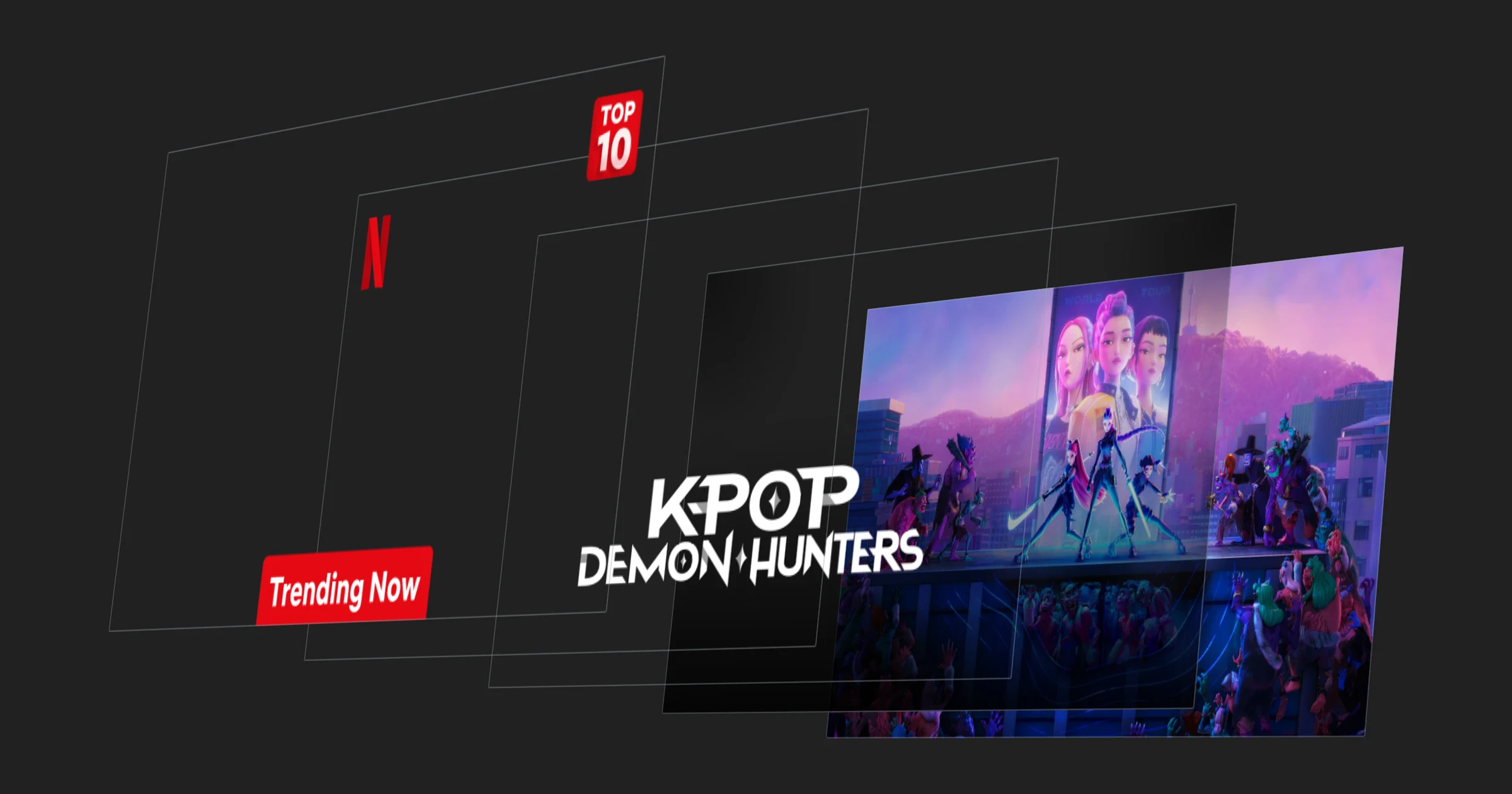
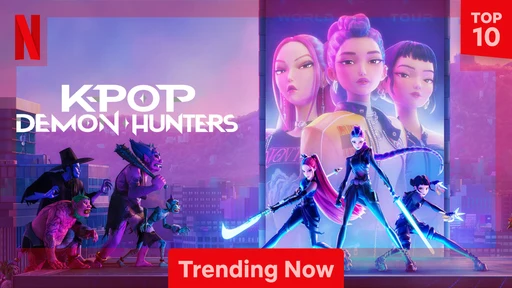
The new artwork is assembled from parts instead of using one finished image:
- Background art cropped so the subject is always centered
- The title logo, centered at a fixed distance from the bottom
- A larger, predictable safe area for the Netflix “N,” Top 10 and bottom badges
- The “N” and Top 10 badge moved in from the corners so very rounded corners can’t clip them

Safe areas, in red, on the old artwork (left) and the composed artwork (right). The old artwork left only narrow strips along the edges; the composed artwork is safe across nearly the whole tile.
How I built it
Every tile is built by a recipe. It assembles the layers, localizes the badge text for every language and country we support, and outputs one flat image, because partners can only display a static image. So the design was a set of rules that had to work for every title, in every language, inside any partner’s crop. I worked with the engineering team behind Netflix’s asset pipeline to turn those rules into the recipe.




The completed design is made up of the following layers. Hover over or tap each one to see where that layer lives in the stack.
The same recipe also builds vertical tiles from the same layers. The background art is cropped to the taller shape, and the title, the N, and the badges are placed by the same rules. Partners that show vertical tiles get the same consistent row and the same room for badges.


The same layers composed for a vertical tile (left), and its safe area in red (right).
The outcome
- Shipped across the Netflix row in 2026. Titles now sit in the same place on every tile, and badges no longer get cut off by rounded corners.
- It’s the foundation for what comes next. With room to grow, we extended the red badges where they were needed: a new white badge with a colored icon, starting with games and designed to take on the other content types coming to the row, and the live badge that shows the event time.
- A clear rule for when to diverge. We stay consistent with the member experience by default and diverge only with evidence.
I’d do the same again. The badges and the artwork needed different bars: the new badges had to prove they fit our canvas, and they didn’t; the artwork had to prove it did no harm, and it did. Testing them separately is why we could ship one and drop the other.