A simpler mobile player that people watched more
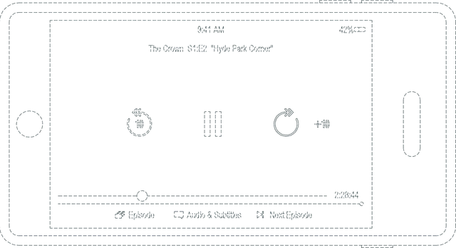
Refining the mobile player's controls for usability, which also increased streaming and earned a design patent.
In brief
- The problem
- Netflix's mobile player hadn't changed much in years, and basic interactions like scrubbing felt clunky on a small screen.
- What changed
- The redesign increased overall streaming, which we hadn't expected, and the team was awarded a U.S. design patent for the player.
- My part
- I worked on the scrubbing concepts and the refined controls that shipped, and built my first fully native iOS prototype in Swift to test playback, haptics, and momentum scrolling.
Keep reading for the full story, or skip to the next case study, Downloads that manage themselves →
The full story
By 2017, Netflix’s mobile player hadn’t changed much in years, and basic interactions like scrubbing felt clunky on a small screen. We set out to make the player easier to use, without expecting it to move business metrics.
Exploring new approaches to scrubbing
Scrubbing, dragging through the timeline to find a moment, works well with a mouse but is hard to do precisely on a phone. Our early explorations questioned how it should work.
One concept introduced a “filmstrip” across the bottom of the player. Instead of a traditional scrubber, you’d swipe the filmstrip left or right to move through the video, with momentum carrying you further the harder you swiped.
Another concept kept the familiar forward/back tap behavior, but added a new gesture: tap and hold on either button to reveal a secondary UI for fine-grained scrubbing within a narrow time window. More precision, without replacing the simple interaction most people already understood.
Those two were the ones we took furthest, but I prototyped many more ways to move through a video, to feel how each one worked in the hand:
In testing, the filmstrip and tap-and-hold concepts were both too complex.
Testing pointed us back to simple buttons
People had to stop and think about how the filmstrip and tap-and-hold gestures worked, and that got in the way of watching. We kept iterating and landed on refined forward and back buttons, which were simpler and worked better in testing.
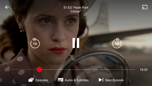
The improvements were in the details: a cleaner layout, better touch targets, and native iOS behavior like momentum scrolling and haptic feedback, which made the controls feel more responsive.
Going native for the prototype
This was my first fully native iOS prototype, built in Swift. It gave us much better video playback and more accurate scrubbing than a web prototype could, and let us test haptic feedback and momentum scrolling as they’d feel in the finished app.
The outcome
We shipped the redesign to improve usability, and it also led to a measurable increase in overall streaming, which we hadn’t expected.
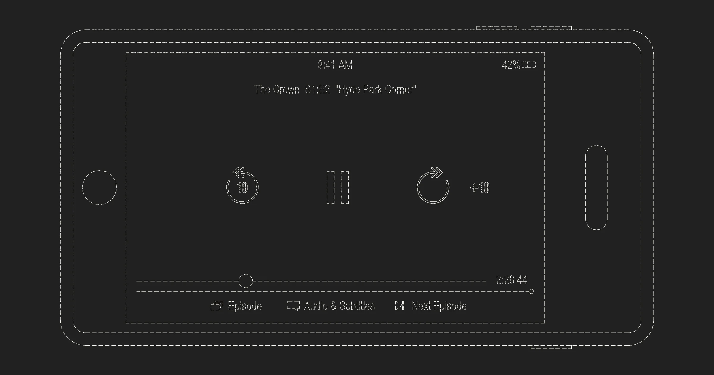
The team was later awarded a U.S. patent (USD892851S1) for the player design and functionality.